Every week, on my painting module, we have a two hour workshop. Sometimes it is a practical session where our tutor attempts to teach us something! These sessions are not about producing a finished painting, which is a good thing because I never managed to complete anything in the two hours! This particular workshop was about using coloured grounds. That is, painting your support with a background colour before you begin. This can be beneficial in a number of ways. One, getting rid of all that white can make it less scary to put colour on it! Two, it can add interest to your painting if allowed to show through or to be the background and three, it can change how a colour interacts with the colours around it.
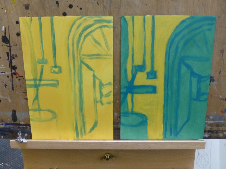
This particular workshop was about how colours interact with each other and how they can change when painted over certain colours. If you look at the photograph above you can see that the yellow almost disappears on the yellow background, while it appears cooler on the green background.
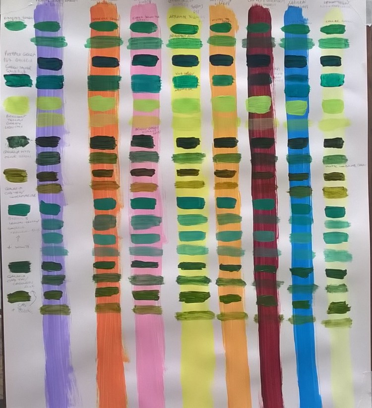
Colour relationships can also be important when you want to try glazing in your painting. Choosing the right colour for your glaze can make all the difference to the atmosphere of your painting. In another workshop we mixed different greens and then painted them over various different colours. Some colours made the green appear warm, some appeared cool and some almost disappeared completely.
When considering a colour for glazing, always make sure that you are using a colour that is transparent. Opaque colours won’t allow the under colour to show through. Most good quality paints will say on them whether they are transparent (t), semi-transparent (s) or opaque (o). I am not an expert at glazing, in fact, I am practically a beginner too, but I am passing on what little I know to you all! If you want to learn more there is a great article on Artists & Illustrators magazine’s website artistsandillustrators.co.uk/…/how-to-layer-colours-5-glazing-essentials and there are some great videos on Youtube of course!
